A good room changes how you live before it changes how it looks. You feel it when you walk in: your shoulders drop, the noise in your head softens, and suddenly home starts doing the job you actually need it to do. That is why dwelling decor tips matter more than most people admit. They are not about showing off a sofa to strangers online. They are about building rooms that calm you down on hard days, wake you up on slow mornings, and make ordinary life feel a little more cared for.
Too many interiors fail for one simple reason: people decorate in pieces instead of in patterns. They buy the lamp first, the rug second, and the art last, then wonder why the room feels like a polite argument. A beautiful space needs more than nice things. It needs direction, rhythm, and a point of view you can actually live with. When you treat decorating like a real conversation between comfort, function, and personality, the room stops feeling staged and starts feeling right. That shift is where great interiors begin.
Start With Feeling Before Furniture
Most rooms go wrong before the first cushion even lands on the sofa. The problem usually starts with a shopping mindset instead of a living mindset. You do not need to ask what furniture fits the room first. You need to ask what mood the room should hold when your day is messy, loud, or rushed. A home that feels settled rarely happens by accident, and the smartest design choices usually begin with an emotional target. When you start there, you stop buying random objects and begin shaping a room with real intent. That one change saves money, reduces regret, and gives the room a steadier identity from the start.
Define the job of the room before choosing a style
Every room has a real job, and it is often different from the one printed in the floor plan. A dining room may be where your kids do homework, where you answer late emails, or where your best conversations happen after everyone should have gone home. Once you name the real job, your choices sharpen fast. The table size changes, the seating changes, and even the lighting starts to make more sense because it serves actual life instead of some imaginary brochure version of it. That is how rooms stop being decorative categories and start becoming reliable parts of your day.
That is why copying a style board straight from social media usually falls flat. The image may look polished, but it was built for the camera, not for your habits. A room with pale fabrics, glass accents, and tiny side tables can look lovely online and feel utterly irritating in a house where people actually spill things and put mugs down without thinking. Design should respect your behavior. If it does not, the room becomes a daily annoyance dressed up as taste. A home should support the way you move through it, not punish you for being an actual person.
I have seen the difference in homes where one small mindset shift changed everything. One friend stopped calling her room a formal lounge and started calling it the reading room. Within a week, the stiff chairs were gone, a deep lamp moved in, and the whole space finally made sense. Another family stopped pretending the guest room was for guests and turned it into a shared study with a daybed. Naming the room honestly is half the battle, because honest names lead to useful decisions and useful decisions usually look better too. Once the room has a real purpose, style has somewhere solid to stand.
Choose a mood palette, not just a color palette
Color matters, but mood matters more. Plenty of rooms use attractive shades and still feel off because the colors do not support the life happening inside them. A room for slow evenings wants warmer undertones, softer contrast, and materials that absorb light instead of bouncing it around like a showroom. A workspace may need cleaner contrast and steadier energy. The colors are not just decoration. They are background psychology, working quietly while you live your day. Get that part right and the room starts helping before you even notice it.
A useful trick is to build a palette out of emotional words first. Think grounded, airy, intimate, crisp, restful, or cheerful. Those words guide better choices than vague promises like modern or elegant because they push you toward how the room should feel on an ordinary Tuesday, not just how it should photograph on a sunny afternoon. You also avoid the trap of choosing colors you admire from afar but never enjoy living with up close. Admiration is not the same thing as comfort. That distinction sounds small, but it saves people from living inside rooms that impress guests and quietly exhaust everyone else.
This is where small decisions do real work. Cream walls with walnut wood feel different from stark white walls with black metal, even if both are technically clean and current. The right palette creates atmosphere without shouting. A room should not beg for attention. It should earn your trust slowly. If you have ever walked into a home and felt instantly settled without knowing why, chances are the colors were carrying more of the mood than any statement piece in the room. The palette set the tone, and everything else simply followed.
Layer Texture So the Room Feels Lived In
Once the mood is clear, surfaces take over. This is the stage where many homes look tidy but still feel flat, almost like a catalog spread waiting for people who never arrive. Texture fixes that. It adds warmth, depth, and the kind of visual softness that makes a room feel inhabited rather than arranged. Beautiful interiors are rarely built by color alone. They win through contrast you can see and comfort you can almost touch. If mood is the script, texture is the voice that makes the room believable. It is the difference between a room that looks finished in a photo and one that feels comforting in person.
Mix hard and soft finishes with intention
A room full of soft pieces can feel sleepy. A room full of hard finishes can feel cold enough to bounce your thoughts back at you. The sweet spot sits somewhere in the middle, where linen meets wood, stone meets wool, and clean lines meet something slightly relaxed. Contrast gives the room pulse. It also keeps the space from leaning too heavily into one mood, which is often what makes a room feel either fussy or lifeless. Good contrast steadies the room while keeping it interesting.
Think about how a simple living room changes when you add one chunky knit throw to a sharp-lined sofa, or when a sleek coffee table sits over a forgiving woven rug. Those pairings make the space less one-note. They also help expensive pieces feel less precious, which is often the difference between stylish and stiff. The room starts to look used in the best way. Not damaged. Just believable, like people actually laugh there, stretch out there, and put their feet up without asking permission. That ease is what most polished rooms are missing.
The best combinations are not always the obvious ones. A smooth plaster wall behind a vintage oak cabinet can feel richer than a room packed with matching mid-tone furniture. A matte ceramic lamp on a glossy side table creates a small moment of friction, and that friction is good. It keeps the room awake. I would take that over a perfectly coordinated set any day, because perfect matching often kills the energy that makes a room memorable. Rooms need contrast the way good meals need salt. Not much. Just enough to wake everything up.
Use fabric, wood, and natural material to create beautiful interiors
Nothing rescues a flat room faster than materials with character. Cotton, jute, oak, rattan, wool, leather, and stone all carry texture in a way printed patterns cannot fake. They age, soften, and gather visual depth over time. That makes the room feel human, which is harder to achieve than people think. You can buy trend pieces all year and still miss that feeling if the materials have no soul in them. Real texture does not need to announce itself. It just keeps making the room better.
When you are choosing between two pieces, the one with a little grain, weave, or irregularity often wins in the long run. Machine-perfect finishes can start to feel sterile, especially when every surface in the room shares the same level of polish. You need some roughness. Not mess. Just evidence of life. Even a small side stool with visible wood grain can warm up an entire corner that previously looked too slick to relax in. That kind of warmth is subtle, but it sticks.
This is also the perfect place to borrow fresh ideas from thoughtful interior inspiration. The best examples are not the busiest ones. They are the spaces where material choices do the heavy lifting, so the room feels rich even when the styling stays restrained. That is the kind of restraint worth stealing. A linen curtain that falls properly, a solid timber bench by the entry, or a handmade bowl on a shelf can change the whole tone of a room without turning it into a production. Those details do not scream for attention, which is exactly why they age so well.
Make Decor Work Harder Than It Looks
A room earns its beauty when it also solves problems. That may sound unromantic, but it is the truth. The prettiest corners in a home are often the ones that quietly handle real life: clutter, poor lighting, awkward layouts, and the endless pile of objects that seem to breed overnight. Good decor should please the eye, yes, but it should also make the room easier to use when nobody is visiting. Function is not the enemy of style. Usually, it is the reason style survives past the first week. Pretty things last longer when the room around them actually works.
Style storage so function does not kill the mood
Storage gets treated like a practical afterthought, which is a mistake. The way you hide, display, and group everyday items shapes the room more than a single trendy accessory ever will. A beautiful basket by the sofa, a closed cabinet under the television, or a narrow console near the entry can save a room from visual chaos. The smartest storage pieces do their job quietly, almost like good manners. You notice the calm they create more than the object itself. That quiet kind of usefulness gives a room dignity.
The trick is to store by behavior, not by category. Keep blankets where people actually reach for them. Put trays where loose objects tend to gather. Use lidded boxes for the small visual annoyances that make a room feel messy by 4 p.m. You are not just tidying. You are reducing friction in the way the room gets used. That matters far more than arranging books by color and hoping the room somehow feels settled because the shelf looks clever. Beauty follows usefulness more often than people expect.
I am opinionated about this one: random clutter ruins more interiors than bad paint ever will. Not because clutter means you are lazy, but because it breaks the room’s rhythm. The eye has nowhere to rest. Thoughtful storage lets your favorite pieces breathe, and suddenly the room looks more expensive without costing you a rupee more. One living room I know changed completely after the owners swapped three open plastic bins for one low wood cabinet. Same stuff. Different feeling. That is the power of presentation, and it is wildly underrated.
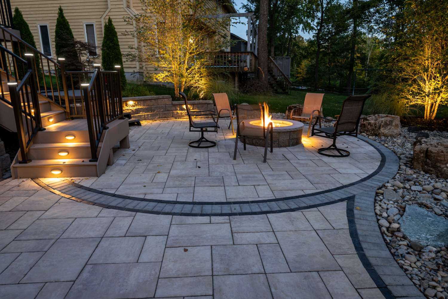
Light the room in layers, not in one blast
Harsh overhead lighting can make even lovely rooms look tired. It flattens texture, drains color, and turns evening into a dentist’s office. Layered lighting does the opposite. It gives the room dimension and lets you shift the mood depending on the hour, the weather, or your energy. If you ever wonder why a hotel lounge feels nicer than a brightly lit waiting room, lighting is usually the answer before furniture even enters the conversation. Light decides whether a room feels exposed or embraced.
A strong lighting plan usually includes three parts: ambient light for general visibility, task light for reading or working, and accent light for atmosphere. That can be as simple as a ceiling fixture, a floor lamp near a chair, and a small table lamp warming up the darkest corner. Simple works. It just needs intention. Even a dim corner can become useful once you place the right lamp there, and usefulness has a funny way of making a room look more beautiful. One lamp by itself is rarely enough for a room you actually live in.
One of the best dwelling decor tips I know is to test your room at night before you call it finished. Daylight flatters almost everything. Evening tells the truth. If the room feels gloomy, exposed, or weirdly clinical after sunset, the decor is not done yet. It is only dressed for half the day. Candles can help, yes, but lamps do the real heavy lifting. A home should know how to hold you after dark, not just impress you at noon. If the room only works in perfect daylight, it is not finished. It is posing.
Add Personality Without Turning the Room Into a Scrapbook
After mood, texture, and function are in place, the room needs a pulse that belongs to you. This is where personality enters, and people often overcorrect. They either play it so safe that the home feels anonymous, or they cram every memory, color, and novelty into one space until it becomes visual static. Real character lives in selective choices, not in endless display. The room should tell your story in a measured voice, not shout your biography from every shelf. Personality lands better when it has breathing room around it.
Show personal taste through edit, not excess
A home with soul is usually well edited. That surprises people because they think personality means adding more and more until the room looks unmistakably personal. The opposite is often true. When everything asks for attention, nothing says much. Editing is what gives your favorite things a voice. It also gives the room confidence, because restraint often reads as clarity rather than absence. A room with a clear point of view almost always feels warmer than one crowded with options.
Choose a few objects that carry weight. Maybe it is a crooked ceramic bowl from a local maker, a framed textile from a family trip, or an old chair you almost threw out but wisely kept. Pieces like that bring memory into the room without turning it into a museum of every phase you have ever had. One strong object can often do more emotional work than ten decorative fillers bought in a hurry on a Saturday afternoon. That is the difference between decorating and collecting proof that you went shopping.
This is also where confidence matters. If you love one odd piece that does not match the rest perfectly, keep it. A room that feels slightly too tidy often lacks surprise. The trick is not to collect more things. It is to let a few meaningful ones take the lead and let the rest step back. People remember rooms with conviction, not rooms that tried to please every trend forecast and lost their nerve halfway through. Taste gets stronger when you stop apologizing for it.
Create visual rhythm with art, objects, and negative space
Good styling has pacing, just like good writing. You need moments of detail, moments of calm, and a clear sense of where the eye should pause before moving on. That is why blank space matters. A wall does not fail because it stays partly empty. Sometimes it succeeds because of it. Rooms need silence too. Without that silence, every object starts competing and the whole space grows visually noisy. Calm space is not wasted space.
Art should sit in conversation with the room, not hover above it like an unrelated announcement. A large piece can steady a busy corner. A cluster of smaller works can loosen up a rigid wall. Decorative objects work the same way. Group them by shape, height, or tone so they feel intentional instead of accidental. If a shelf looks chaotic, it usually needs subtraction before it needs another candle holder or another stack of books. Editing is often the most effective styling move in the whole room.
The smartest rooms know when to stop. That sounds simple, but it is rare. Before buying one more vase or cushion, look for what the room is already saying. Then give it room to finish the sentence. You can find more ideas in home styling features, but the real win comes when your room feels recognizably yours, not expertly borrowed. That is the point where decorating stops being performance and starts becoming home. And that, frankly, is the whole point.
Conclusion
The homes that stay with you are not always the largest, newest, or most expensive. They are the ones that feel resolved. Every choice seems to understand the people living there, from the lamp beside the favorite chair to the basket that quietly catches the daily mess before it spreads. That kind of beauty does not come from chasing trends. It comes from noticing what your rooms ask for and answering with honesty.
The strongest dwelling decor tips are usually the least flashy. Start with feeling, layer texture, fix the practical problems, and then add personality with a sharper eye than most people use. That order matters. It keeps you from decorating on impulse and helps each room grow into itself instead of pretending to be something else. Rooms become more beautiful when they are allowed to be useful, calm, and a little personal all at once.
So take one room this week and look at it without excuses. Keep what works. Move what does not. Add warmth where it feels thin, storage where it feels stressed, and character where it feels forgettable. Then keep going. A beautiful interior is not built in one grand weekend. It is shaped choice by choice, and the next smart choice is yours.
FAQ 1: What are the best dwelling decor tips for small homes?
Small homes benefit most from furniture that earns its place, layered lighting, and storage that hides daily mess. Keep sightlines open, use texture for warmth, and resist overcrowding. A small room feels bigger when every item has purpose and room.
FAQ 2: How do I make my home look expensive on a budget?
Focus on lighting, fabric, and clutter control before buying statement pieces. A room looks richer when curtains hang properly, surfaces stay clear, and materials feel tactile. Paint, secondhand wood furniture, and better lamps often beat flashy purchases every single time.
FAQ 3: Which colors make interiors feel more welcoming?
Warm neutrals, muted greens, dusty blues, and earthy clay tones often feel inviting because they soften a room without draining it. Pair them with natural materials and gentle lighting. The goal is comfort with depth, not a flat beige box.
FAQ 4: How can I decorate a room without making it feel crowded?
Start by removing what does not help the room function or feel better. Then group objects with intention instead of scattering them everywhere. Leave blank space around furniture and decor. Rooms breathe better when your eye has places to rest.
FAQ 5: What decor mistakes make interiors look cheap?
Bad lighting, undersized rugs, cluttered surfaces, and too many matching items can make a room feel flat fast. Cheap-looking spaces often suffer from poor proportion, not low budgets. Fix scale, texture, and layout first, and the whole room improves quickly.
FAQ 6: How do I choose decor that matches my personality?
Pay attention to what you keep returning to, not what trends tell you to like. Build around meaningful pieces, favorite materials, and colors that calm or energize you. Personality shows up best through editing, not while decorating on autopilot.
FAQ 7: Should every room in a home match exactly?
No, and frankly that usually makes a home feel stiff. Rooms should relate to each other through color tone, material, or mood, but each one can have its own character. Consistency matters. Sameness does not. That difference keeps homes interesting.
FAQ 8: How often should I update my home decor?
Refresh decor when the room stops serving your life well, not because trends changed again. Seasonal swaps can help, but bigger updates should answer a real need. Most rooms improve more from thoughtful editing and rearranging than from constant shopping.